I didn’t want to write a mermaid book. Adam and Jana had to go to the New World, which would involve a long sea voyage. I didn’t want them to just arrive there and I thought a shipboard story would be too limiting, so I decided to write the story of them wait-ing for a ship. I’d already established Anterwendt, in the Empire’s equivalent of the Netherlands, as the major seaport, but I couldn’t find much folklore or mythology that was uniquely Dutch. So I turned to sea folklore and found a few Dutch mermaid stories.
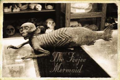
But I didn’t want to write a mermaid book. To be honest, I thought mermaids were a bit, well, girly. Until I found this picture. Suddenly mer-maids could be creepy, and I researched them a bit more enthusiastically, leading me to Sigurd Towrie’s excellent Orkneyjar website, which had a huge influence on the story.
But I didn’t want to write a mermaid book. To be honest, I thought mermaids were a bit, well, girly. Until I found this picture. Suddenly mer-maids could be creepy, and I researched them a bit more enthusiastically, leading me to Sigurd Towrie’s excellent Orkneyjar website, which had a huge influence on the story.
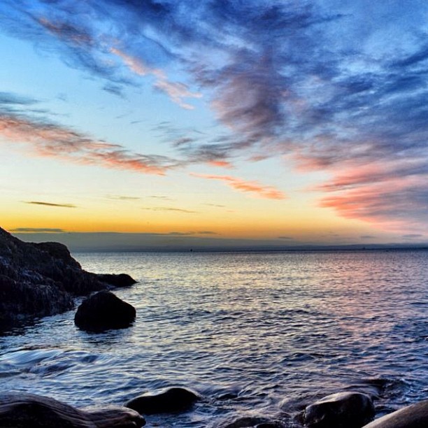
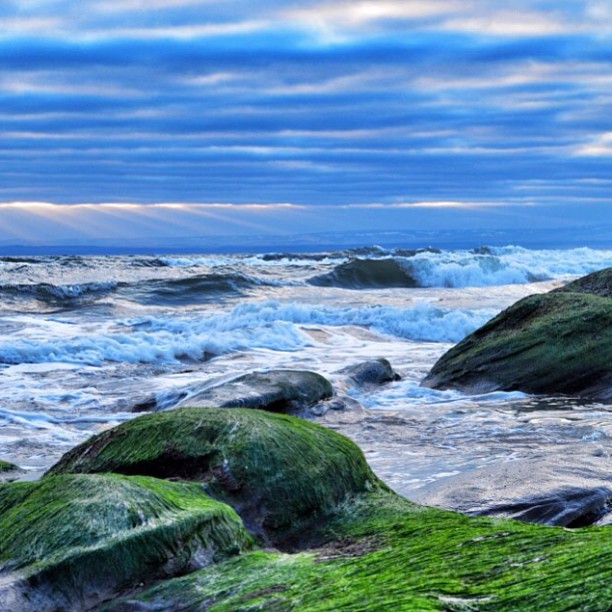
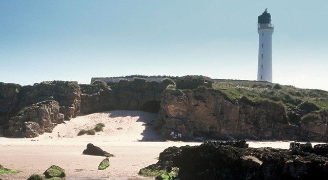
A creepy mermaid was always a shoo-in for the cover, but I was a bit unsure about making it. I thought I’d probably use a real fish tail and maybe a doll for the top half, but I kept putting it off. Meanwhile, my good friend Rosslyn decided to take up photography. For Christmas 2013 her husband bought her a camera and I got her a photography book. On Boxing Day she went to the beach and emailed me her photos. These were the pictures she took on her very first attempt! (Check her Instagram for more of her stunning work.) My book involved a beach, so I immediately asked if she’d photograph the cover. I was thinking of the mermaid crawling up the sand, and I wanted a wraparound with the lighthouse on the back. Rosslyn set about trying to find a suitable location and I set about putting off making the mermaid.
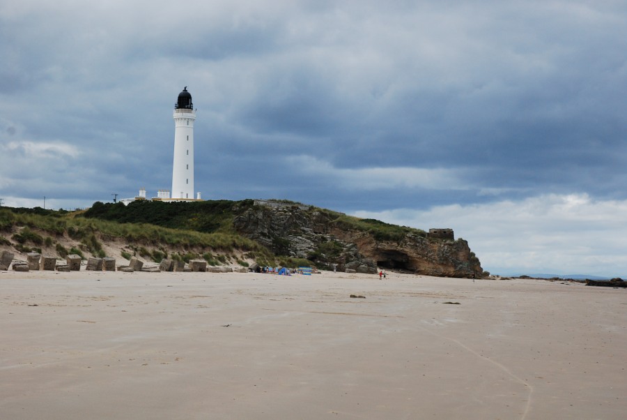
Eventually the book was finished. We still hadn’t found a local lighthouse close enough to the one in the book, and Rosslyn had even suggested driving the 300 miles to Lossiemouth to use the beach and lighthouse the book is based on. But I still didn’t have a mermaid. I really wasn’t sure how to make the top half, or how to join it to the fish tail convincingly. So I looked online for advice and came across a video tutorial on propnomicon. (Exactly how the mermaid was, well, made, will be detailed in part II.)
I had my mermaid, but it was becoming clear Rosslyn would no longer be able to take the photo, and unfortunately she had to bow out – although hopefully we’ll be able to work together on a future cover. Phil Scary stepped into the breach, but he has a different photographic style to Rosslyn and so we had to think about adjusting the cover idea to fit with his style. In ad-dition, Phil wasn’t sure the mermaid crawling up the beach would work, and the model I'd made was smaller than I'd ex-pected and not really built for crawling.
I had my mermaid, but it was becoming clear Rosslyn would no longer be able to take the photo, and unfortunately she had to bow out – although hopefully we’ll be able to work together on a future cover. Phil Scary stepped into the breach, but he has a different photographic style to Rosslyn and so we had to think about adjusting the cover idea to fit with his style. In ad-dition, Phil wasn’t sure the mermaid crawling up the beach would work, and the model I'd made was smaller than I'd ex-pected and not really built for crawling.
| 
|
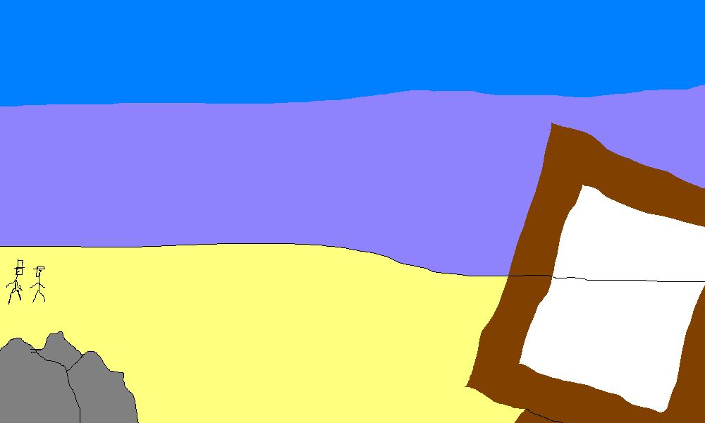
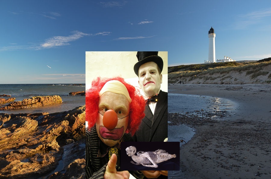
We considered other ideas, some with the mermaid, some without. These included the mermaid in a cabinet or present-ation box of some sort, the Scary Clowns holding the mermaid, and a circus poster showing both mermaid and clowns as well as some of the freak show performers. Phil also came up with a back cover idea we both loved, of the Scary Clowns in the distance walking arm in arm along the beach with their trousers rolled up, carrying buckets and spades. (Mock-ups I did of these are shown.) But the circus and clowns weren’t the central focus of the story, and we kept coming back to the mermaid.
By now it was October, so we decided to go down to the beach at South Queensferry and take some photos of the mermaid before it was too late. The back cover image was already look-ing unlikely as neither of us fancied paddling in our bare feet at this time of year. We got a few mermaid shots before the light faded, and although none of them would be the final cover image, we thought we were going in the right direction.
About a week later I had a change of heart. There was nothing wrong with the photos themselves – they were good – but they were too photorealistic. I wanted something more graphic. We were back at square one and time was running out.
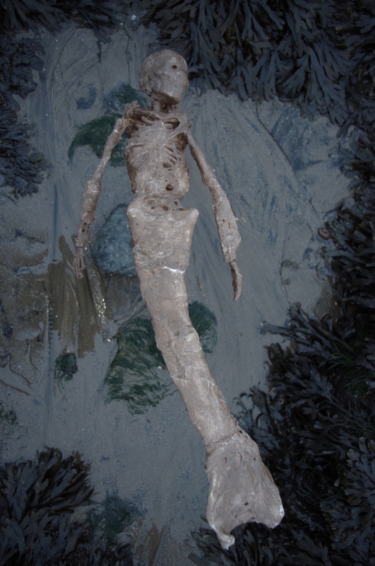
Maybe the beach was the wrong way to go. Maybe we needed something simpler. Phil tried holding the mermaid up to a plain background so the detail was clear. But my living room walls were too bright. We’d always assumed it would get lost on a dark background, but I tried putting it on Phil’s coat and it looked okay. So Phil put it on the carpet and took a picture with his phone, just to see. Of course, the quality was terrible and that would never be the final image, but it would do for reference.
Next day Phil sent me the photo. He’d played around with it using just the filters on his phone. And it looked really creepy. After all that agonising, we took the photo on my living room carpet with a camera phone!
About a week later I had a change of heart. There was nothing wrong with the photos themselves – they were good – but they were too photorealistic. I wanted something more graphic. We were back at square one and time was running out.
Maybe the beach was the wrong way to go. Maybe we needed something simpler. Phil tried holding the mermaid up to a plain background so the detail was clear. But my living room walls were too bright. We’d always assumed it would get lost on a dark background, but I tried putting it on Phil’s coat and it looked okay. So Phil put it on the carpet and took a picture with his phone, just to see. Of course, the quality was terrible and that would never be the final image, but it would do for reference.
Next day Phil sent me the photo. He’d played around with it using just the filters on his phone. And it looked really creepy. After all that agonising, we took the photo on my living room carpet with a camera phone!
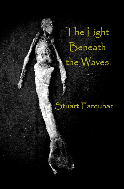
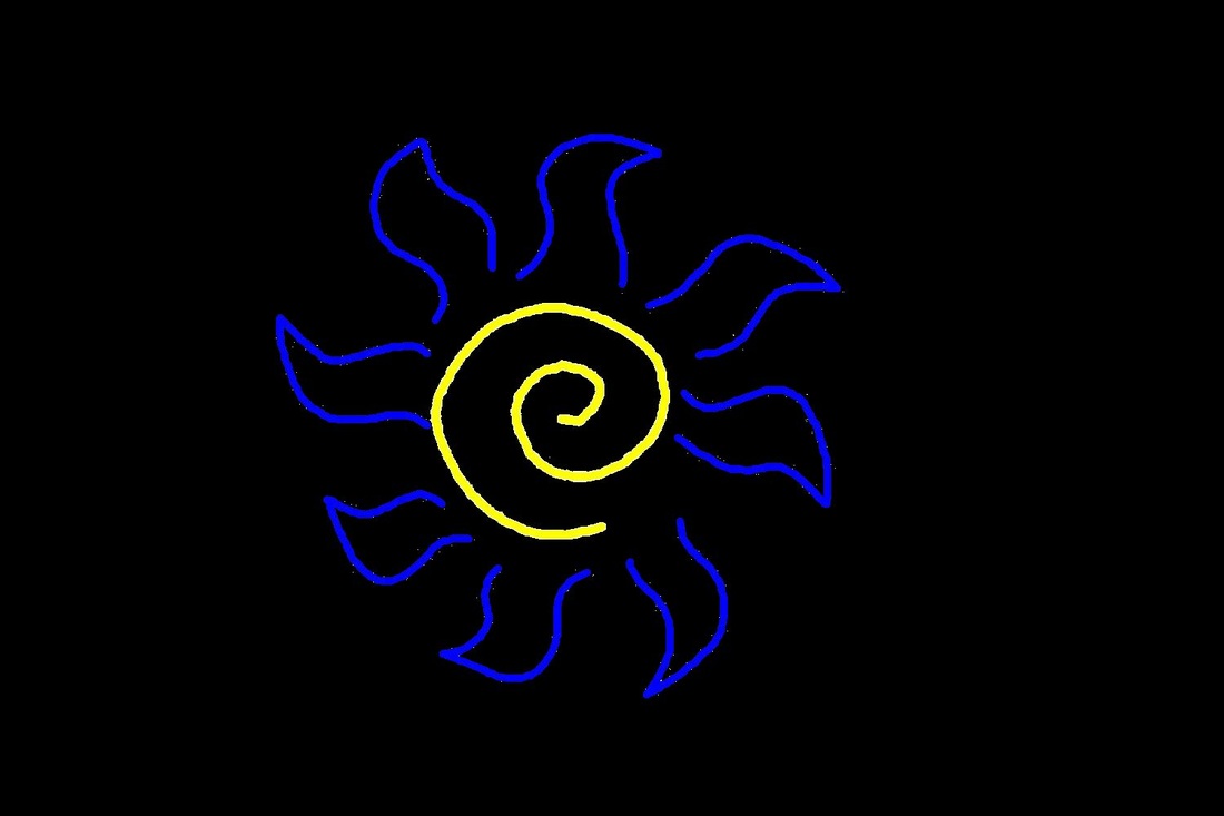
We now had a simple image of just ‘the monster’, which was in-keeping with The Ultimate Dreamer. But I’d known all along I wouldn’t be using the same font. Papyrus is a beautiful font but has become massively overused, to the extent that many graphic designers won’t touch it. I’d expected to use a different font for the first book (Caslon, which ended up on the back cover and on Death Us Do Part), but Papyrus had proved to be the one that worked best with the fossil image. I expected that to be a one-off, but when I tried different fonts with the mermaid picture, it was the one that worked best again. I think its ragged edges look creepy with the right image, and Phil liked it too. This, unexpectedly, provided even more continuity with the Dreamer cover, suggesting we should try and keep the same theme for future books in the series. It meant we could go with a plain black back cover, with just the sun/whirl-pool logo I’d designed for the scene break graphics (to match the similar symbol from Dreamer).
Part II will detail how the mermaid prop was made and will be posted tomorrow.
 RSS Feed